

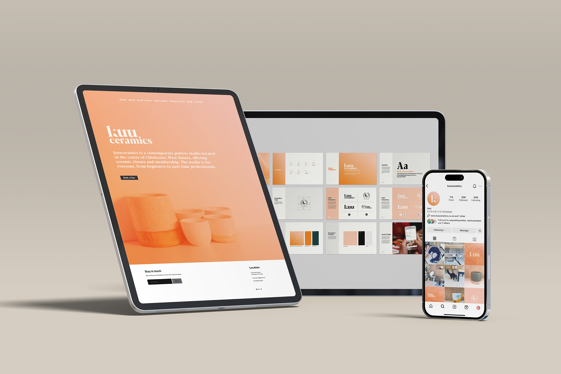
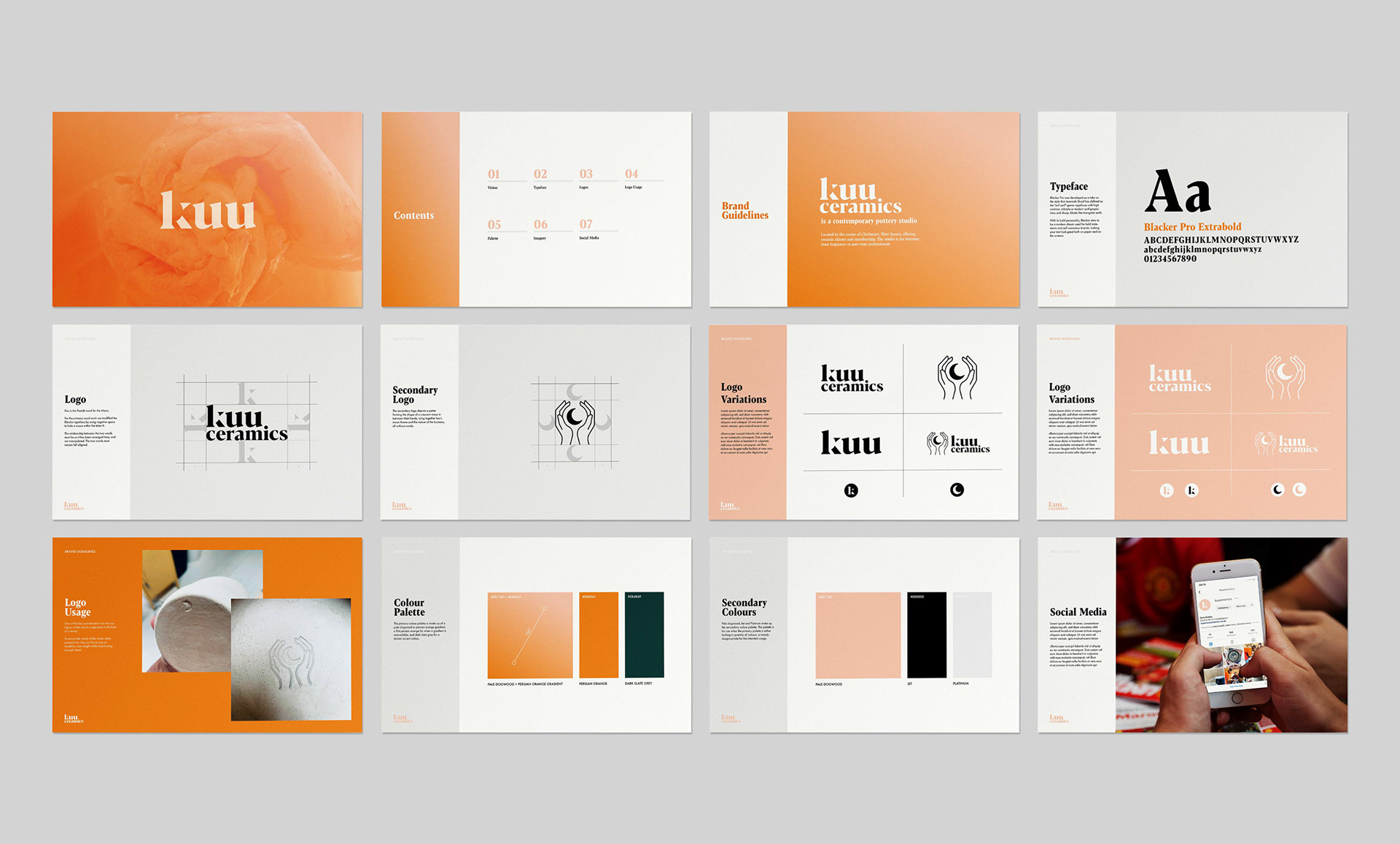
Kuu Ceramics is a contemporary pottery studio located in the centre of Chichester, West Sussex.
THE BRIEF
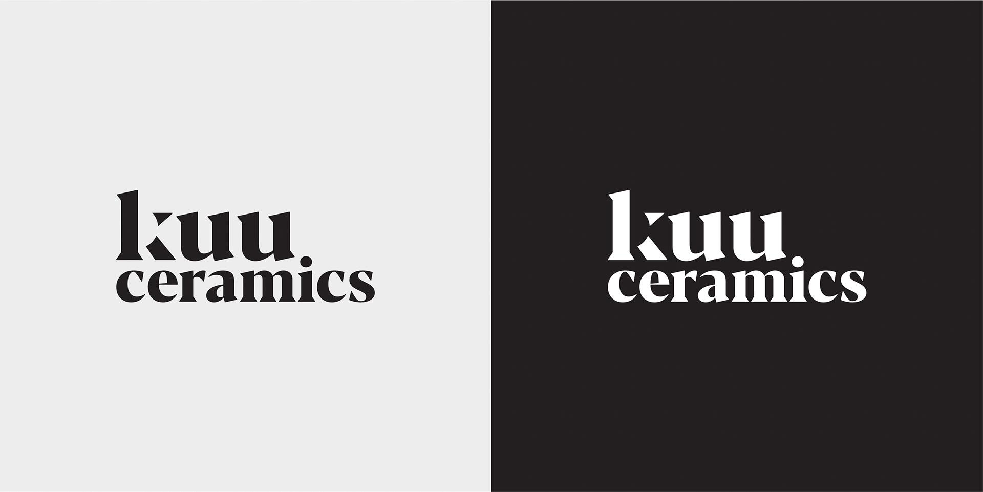
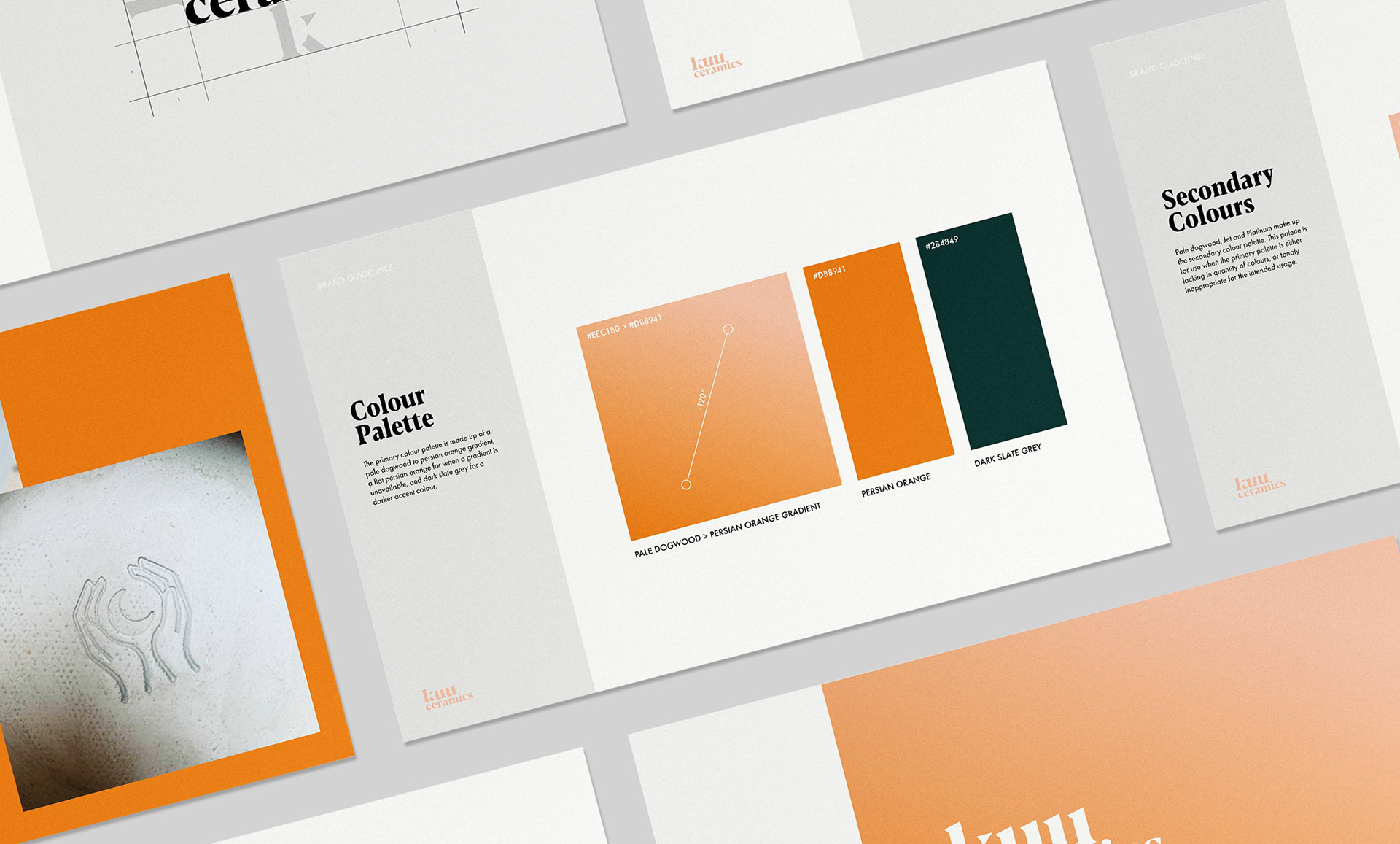
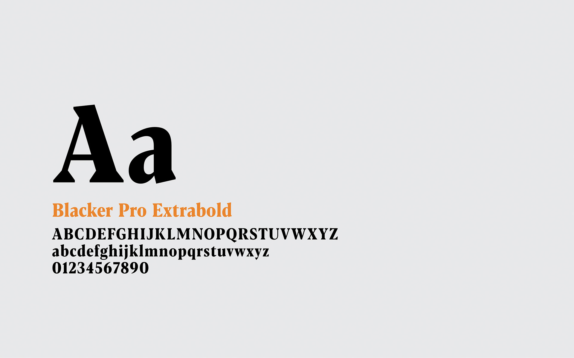
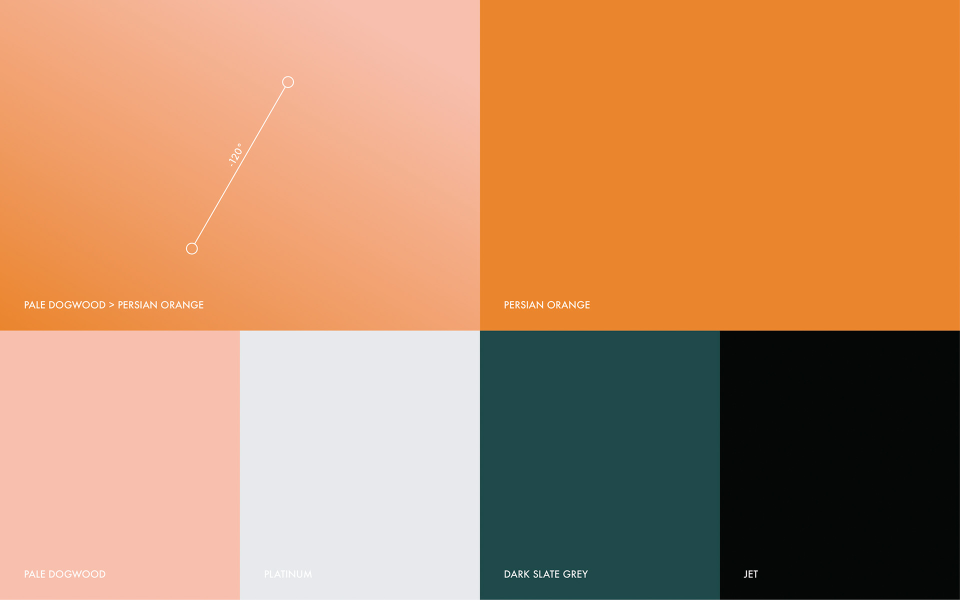
Kuu is the Finnish word for the Moon. kuu are advocates for inclusivity in all forms. They believes that everyone and anyone should have the opportunity to better themselves through art or sharing a safe space and time with other people who have similar interests. They needed a visual identity that championed their values, with a subtle nod to the companies lunar name sake. I was also tasked with staying away from the typical earthy colour schemes of a pottery business - browns, greys and dark greens. This business needs to stand out from the crowd.
THE SOLUTION
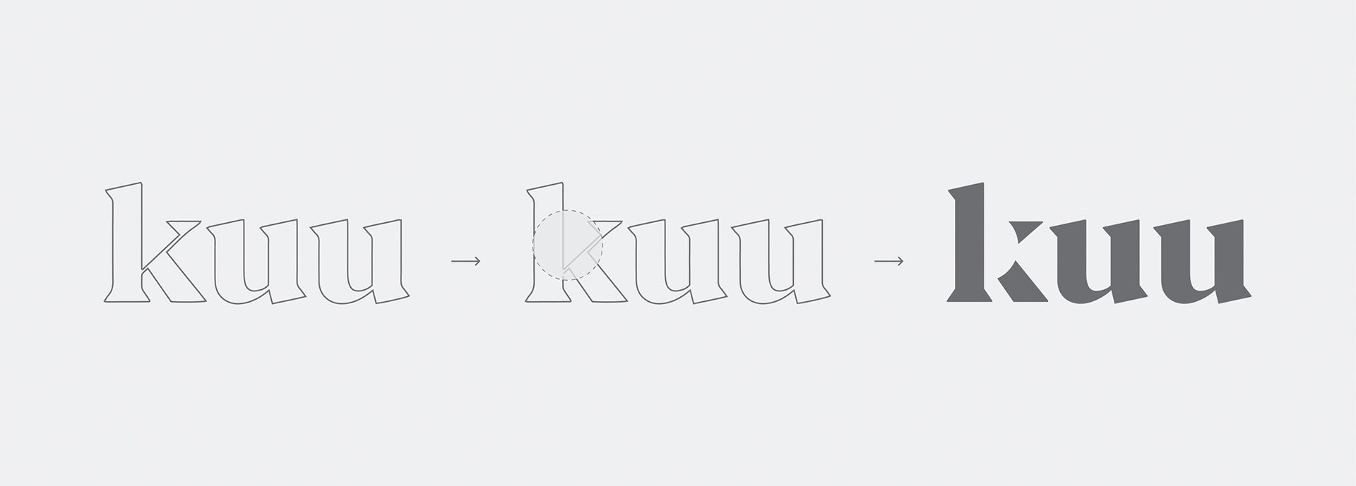
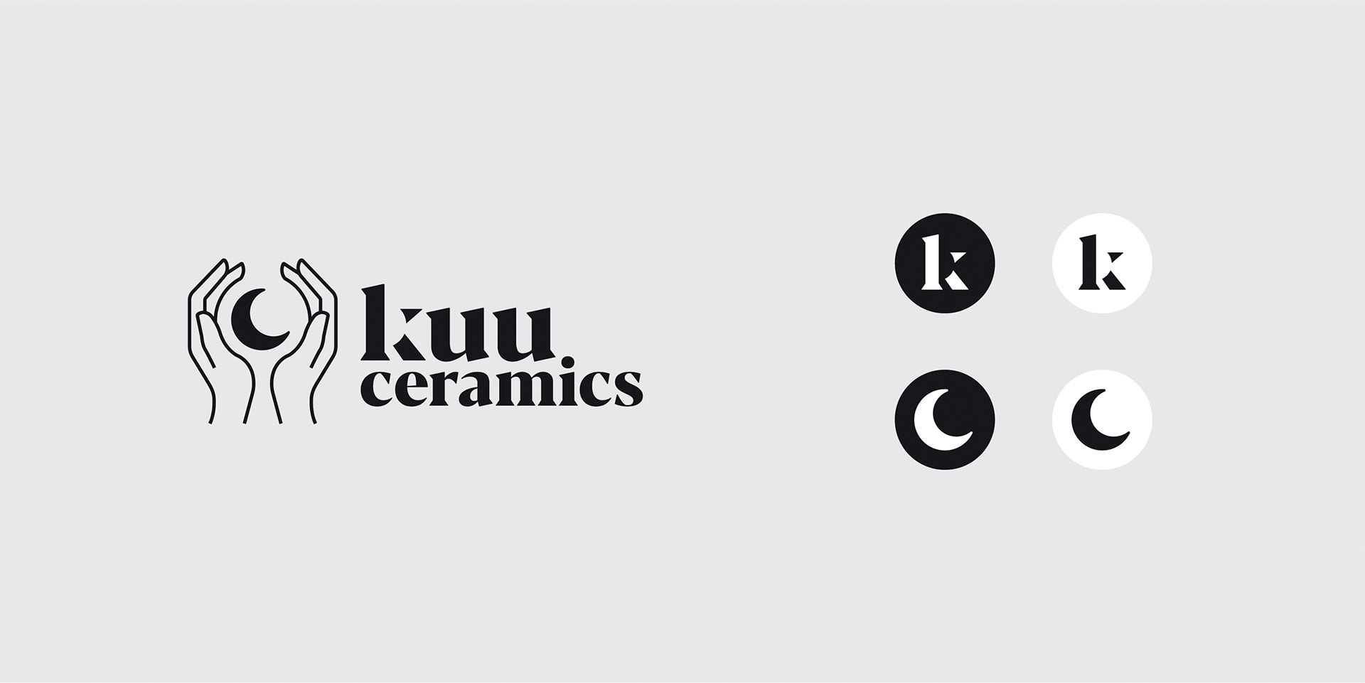
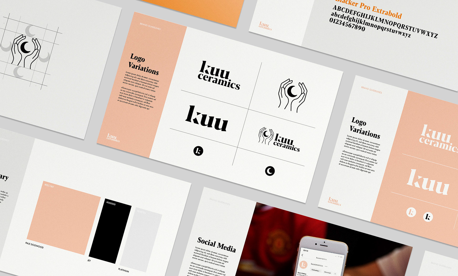
For the primary word mark I used negative space to hide a moon within the letter K without compromising the legibility of the character.
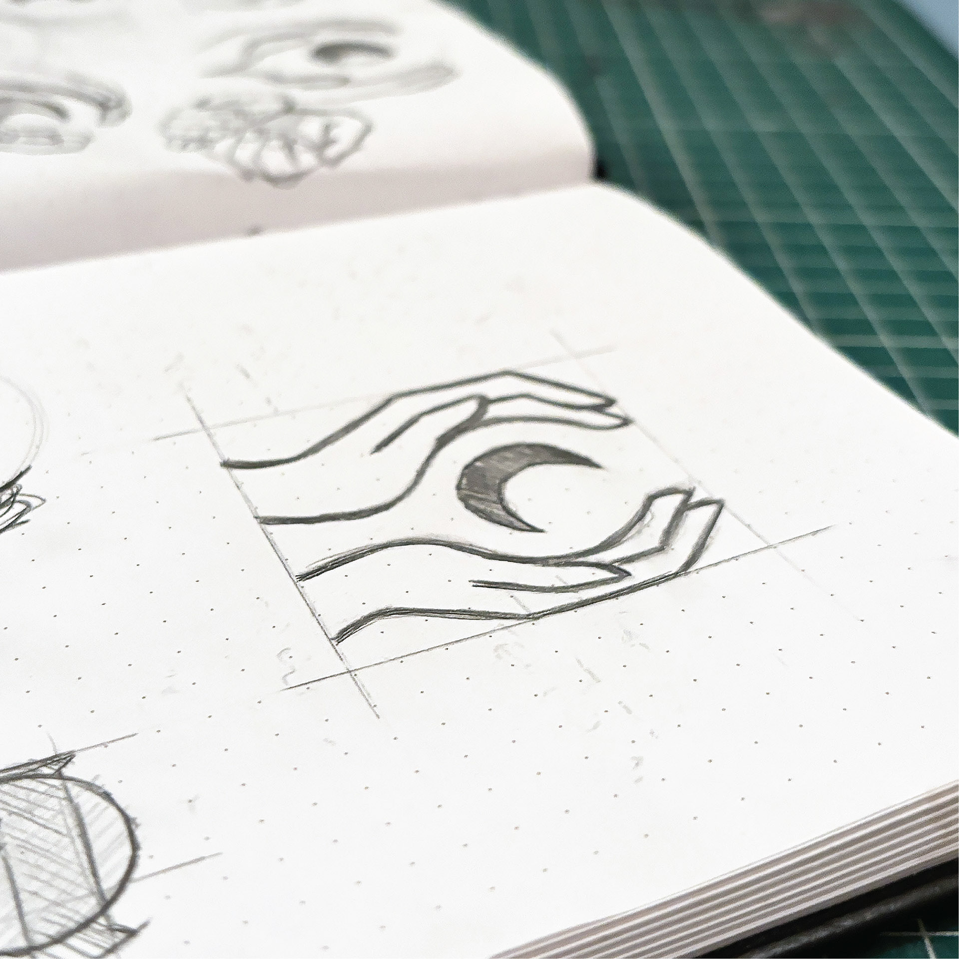
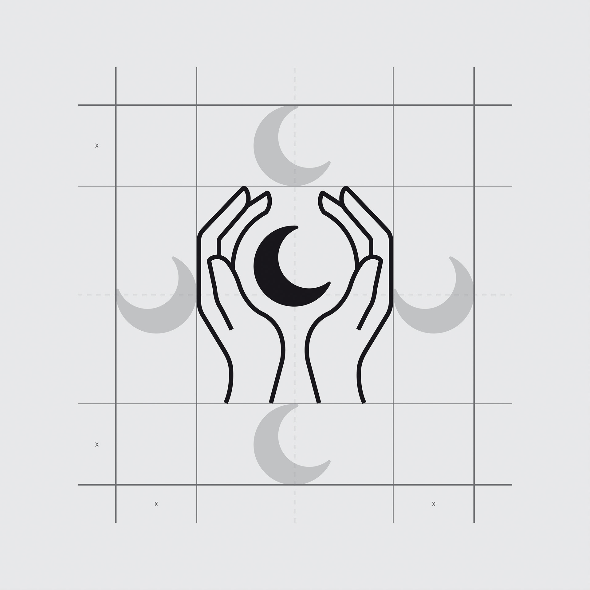
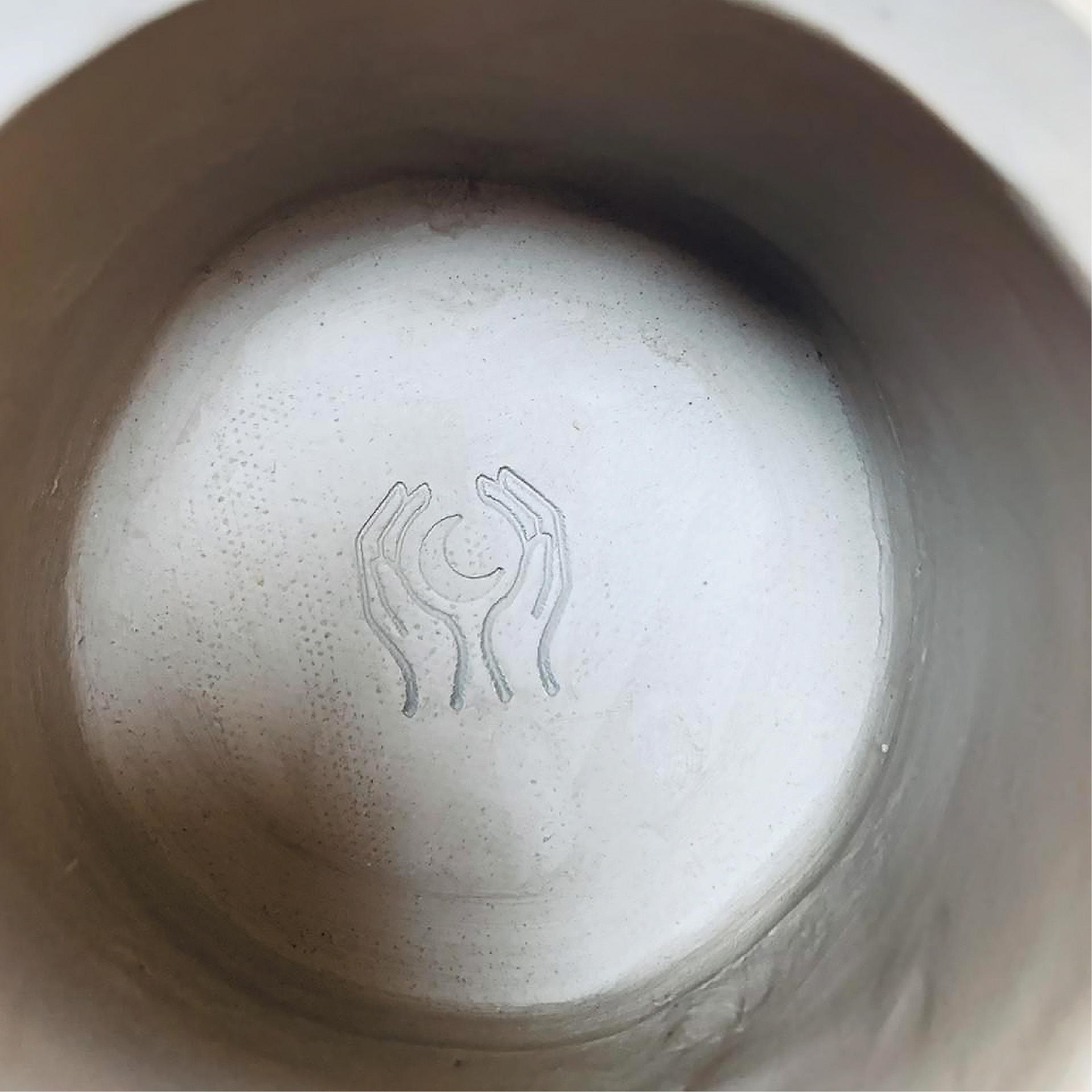
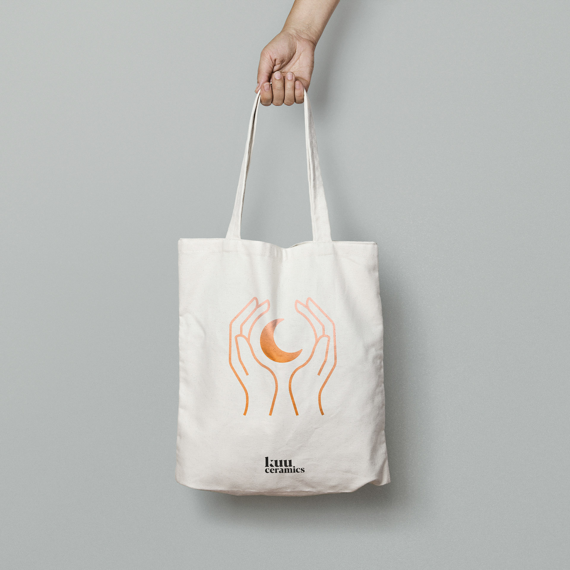
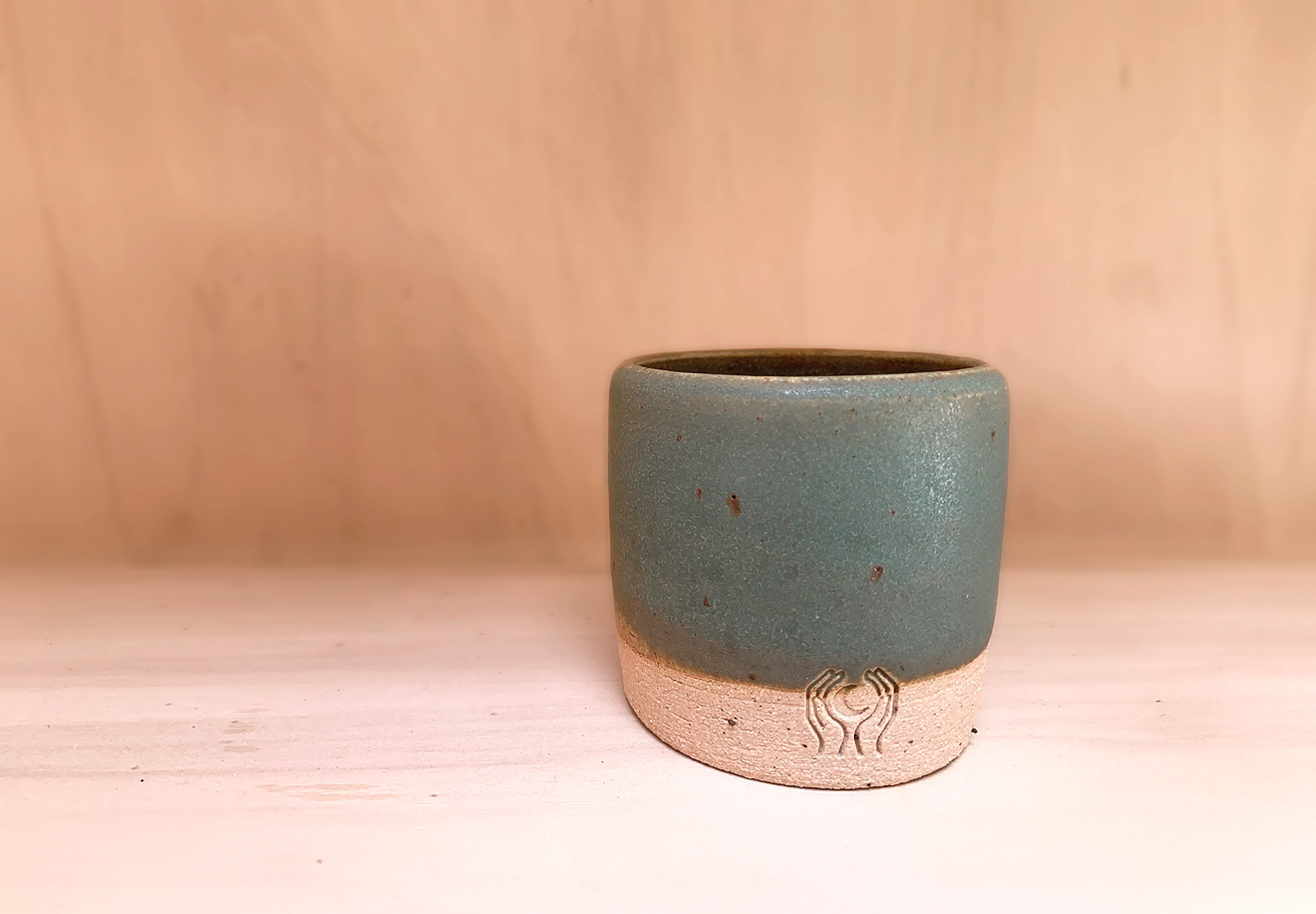
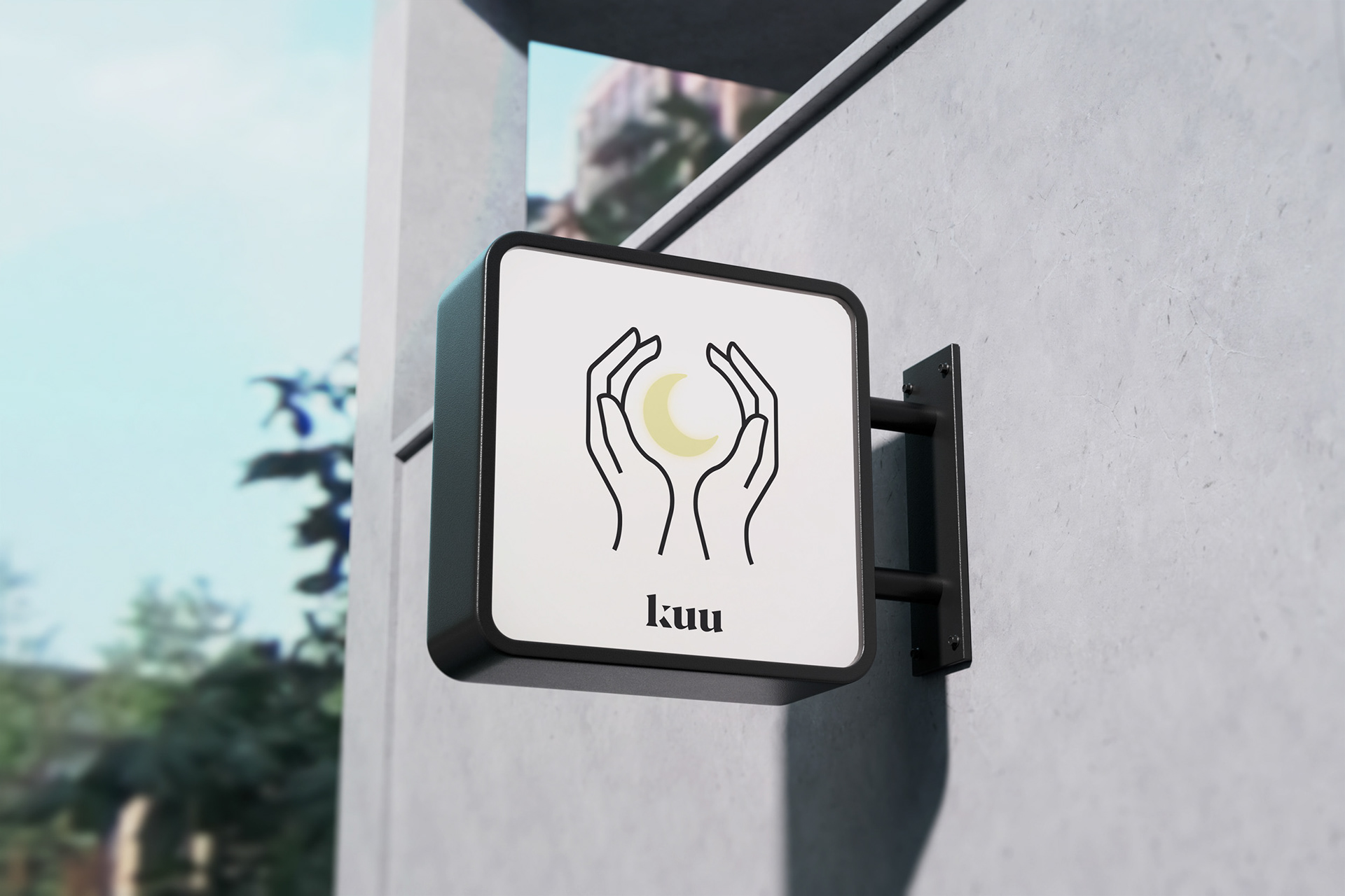
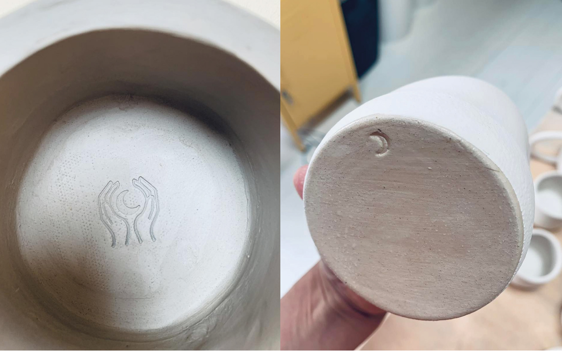
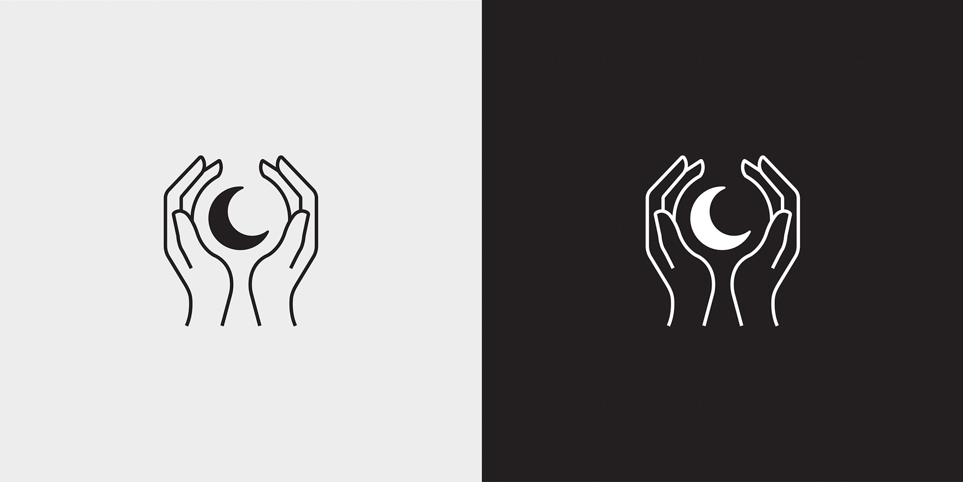
The secondary logo depicts a potter forming the shape of a crescent moon between their hands. The logo being used as a stamp was a key feature in the design process as it required a specific line weight to hold its form when pressed into the clay, and fired.
-
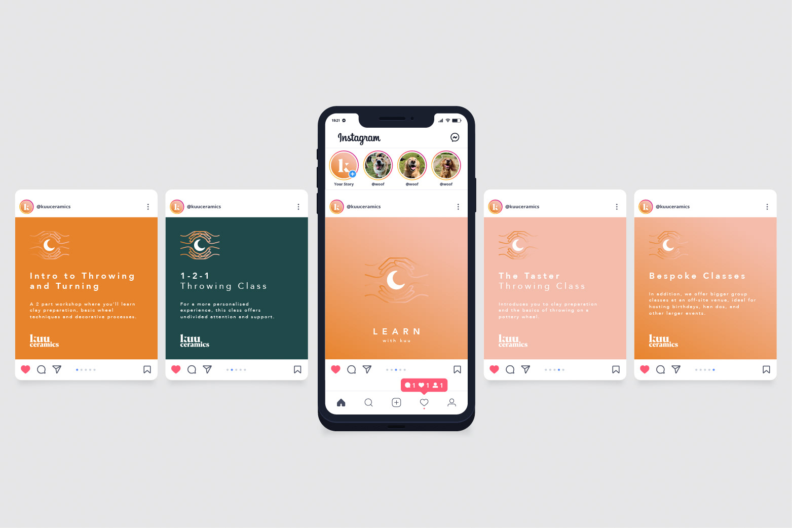
Logo Design, Branding, Promotional Materials


EXTRA CREDIT
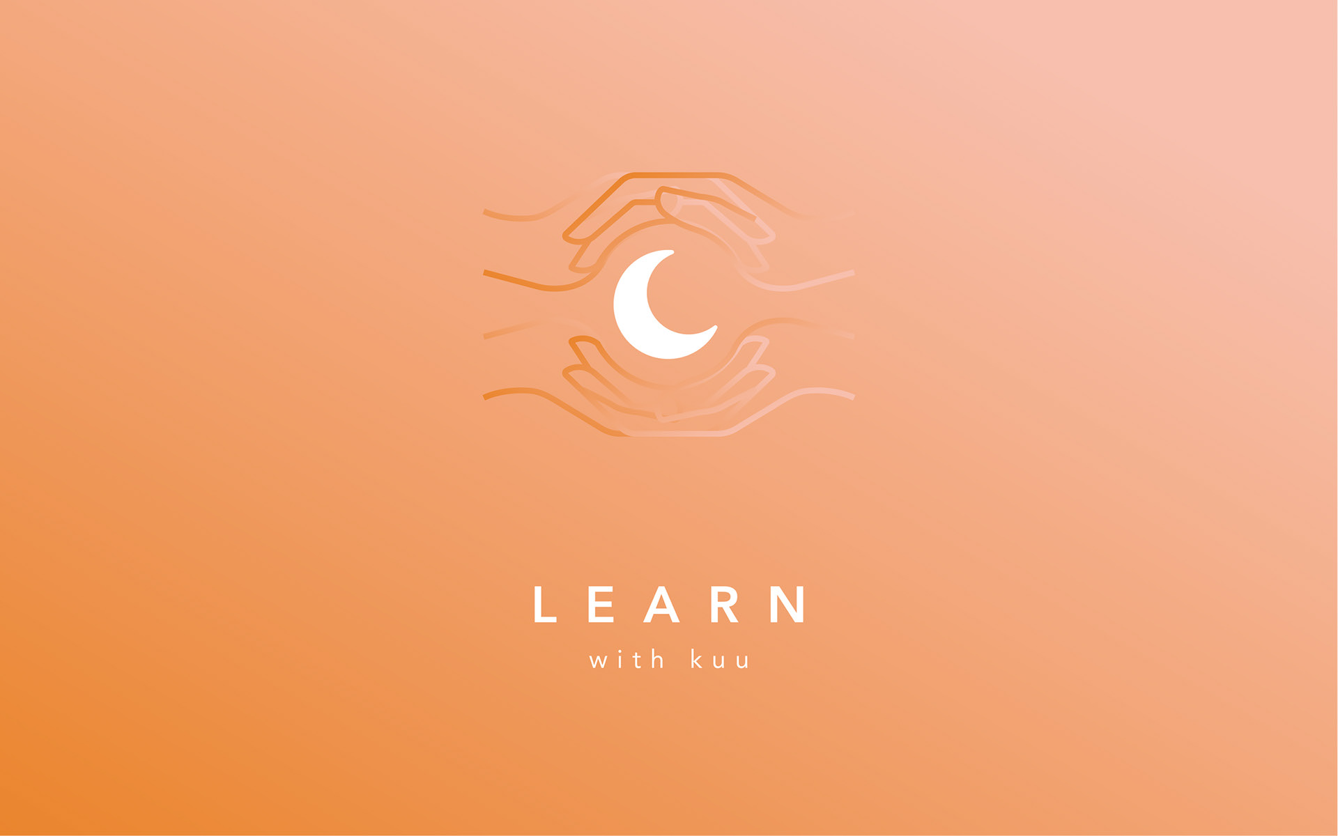
Kuu recently added a teaching element to their studio. To set this apart from the pottery part of the company I designed a sub-brand; Kuu Learn. The branding for this arm of the business adds another pair of hands to the existing 'hands' logo, representing the student-teacher relationship.
TESTIMONIAL
"Professional and precise service. Mark's skill and attention to detail was perfect in delivering exactly the final product that we wanted - stylish and bespoke to our needs. Would highly recommend Clapham Creative. Thanks again!"
Dani, Kuu ceramics
